Stripping Down: The Bold Simplicity of Modern Packaging
Hint: A picture (or signature brand color) is worth a thousand words.
One of the latest trends in packaging design is actually a time-tested tactic making a comeback.
At the turn of the century, a strong reputation was the key to selling products. But after World War II, and with the rise of supermarkets, consumer behavior shifted. Packaging design became all about differentiation.
This ignited the modern packaging wars as we know it, and the relentless battle for shelf attention. With shrinking attention spans, simplicity and convenience became essential. Brands embraced imagery for instant communication. And since a picture is worth a thousand words, they leaned in.
Suddenly, packaging wasn’t just a container; it was a promise. A steaming bowl of soup—so vivid you could almost smell the broth and feel the warmth in your hands—was no longer just a photo; it was an invitation.
But then, packaging became...complicated. Buzzwords took over. Exaggeration became the norm. A frozen meal promised to be gourmet, only to come out of the microwave looking like sad airplane food.
Amid all the noise—brands shouting for attention with the loudest, busiest designs—we’ve come full circle.
Now, the packaging that truly stands out is often the one that says the least: Fewer words, less fluff, a moment of calm in a chaotic sea of "pick me" messaging.
In this micro-report, we explore how minimalism, authenticity, and smart visual cues are helping brands break through the clutter—proving that sometimes, less really is more.
The Shift Back to Transparency
Minimalist packaging has made a strong comeback in recent years, but an increasing number of brands are taking it even further—stripping it down to the essentials: a container, and a clear representation of what’s inside. No excess, no need to say more.
Mag St. Bread Co. (Mumbai) packs pastries in custom printed boxes designed to perfectly fit the contents inside, featuring nothing more than a high-quality, life-size image of the contents and a logo mark.
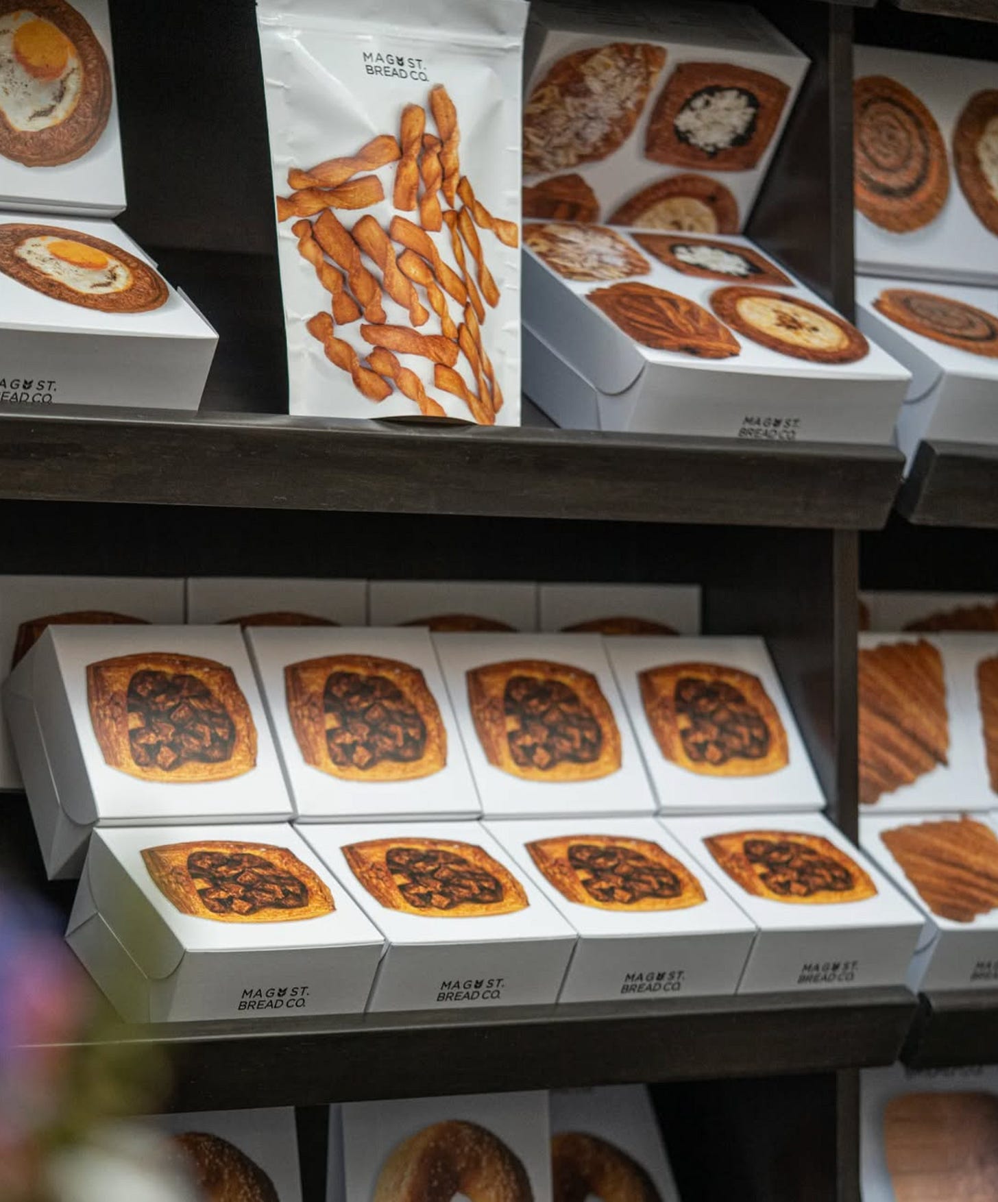
It’s not just about adding a photo of the product. It’s about embracing a simplicity and straightforwardness that eliminates a barrier between the product and the consumer. No tricks, no embellishments.
It's a response to a growing consumer demand for honesty, transparency, and reliability—plus a desire to return to a simpler time when ingredients were recognizable, and products spoke for themselves (mirroring the growing trend of “ingredient households”). This approach extends beyond food, resonating across beauty, home goods, and tech, where clarity, functionality, and purpose take center stage. No distractions, no overpromises—just a clear connection between the product and the person using it.
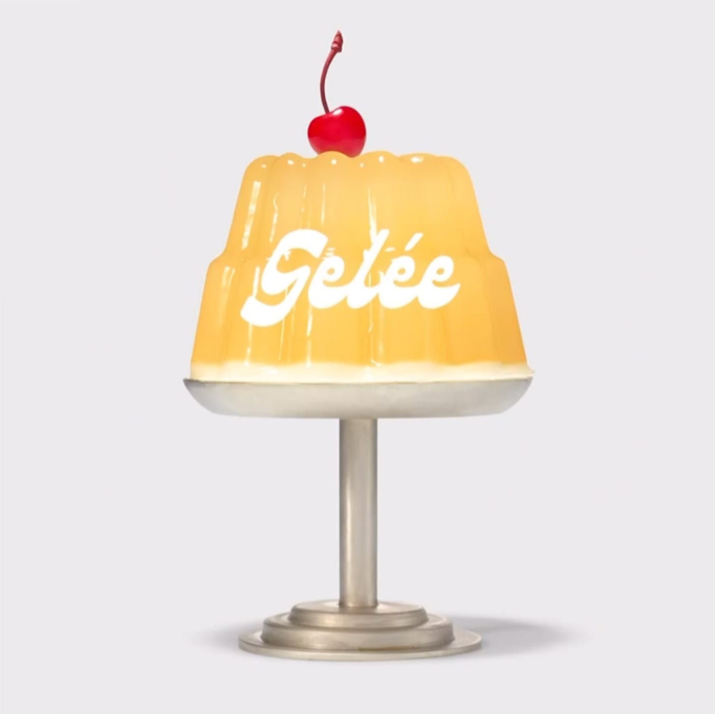
Gelée is a gelatin dessert brand founded by chef and artist Zoe Messinger who wanted to create a new take on Jell-O that was more healthful and creative. The brand has quickly developed a cult-like following for their minimalist packaging, bold branding, and nostalgic, retro-inspired photography, which make the dessert feel fresh yet familiar.
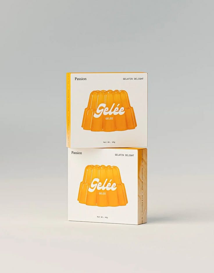
By blending playfulness with sleek simplicity, Gelée has elevated everyone’s favorite childhood desert into a stylish experience that resonates with a new generation of design-savvy (and fun-loving) consumers.
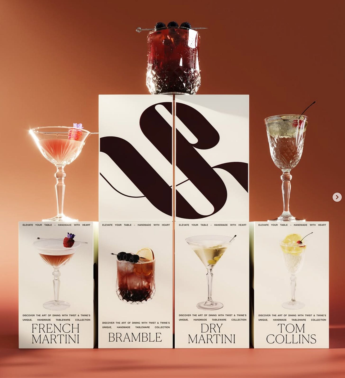
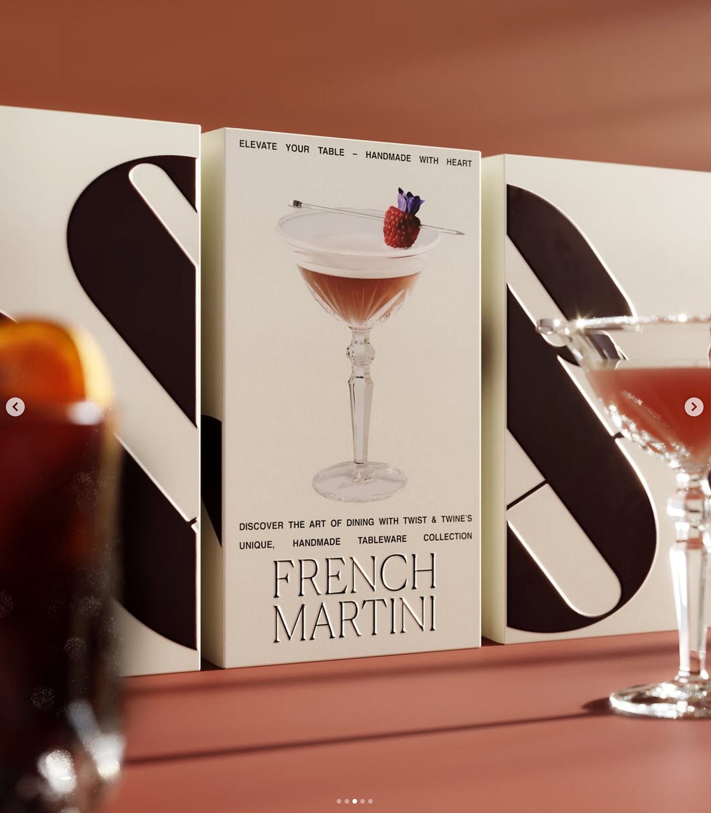
Barcelona-based Blank Space Studio designed new packaging for Twist & Twine Glassware saying, “To stand out on shelves, Twist & Twine embraces bold, transparent packaging that proudly showcases the product’s craftsmanship and design. The packaging highlights the intricate details of each glass, enticing customers with a sneak peek of the quality they’re investing in. The approach is simple yet impactful: let the glassware speak for itself while inviting consumers to mix, match, and elevate their drinking experience.”
Keep reading with a 7-day free trial
Subscribe to Insight Out to keep reading this post and get 7 days of free access to the full post archives.


